process
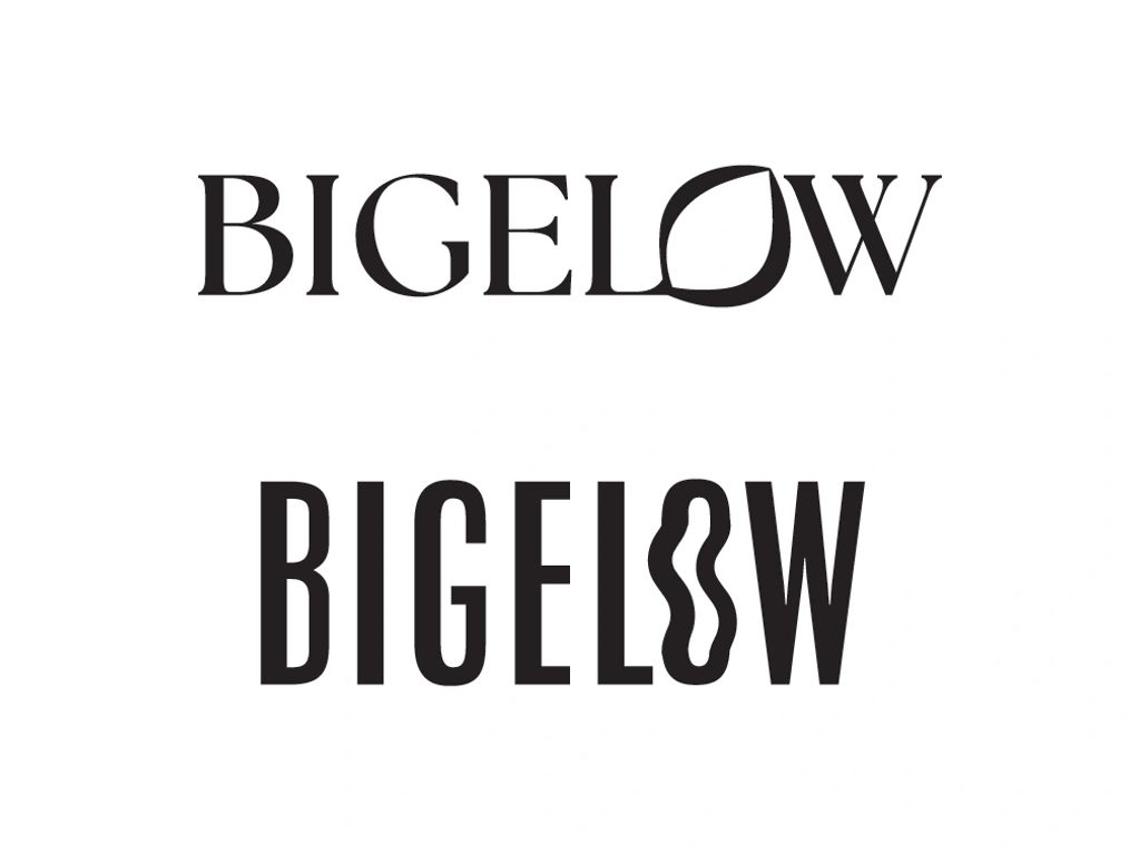
Bigelow Tea doesn't have very consistent branding across products. This is my take on a redesign targeted towards a more youthful audience and with a more cohesive feel.
Here were my two concepts for a new logo. I explored packaging for both options.

I made illustrations for each tea flavor.
Initially I explored this direction but I wanted the final design to feel more modern.

Here are the designs that I landed on.
The front of the tea boxes on the left and the front and back of the tea bags on the right.
results

